are full of texture and colour and rythmn. There is a tactile quality here that is common to the work on canvas and paper and fibre/textile. Van Gough in particular evokes the desire to reach out and touch, much the same as most textile art. There is also a balance of light and dark, tone, tint, shade and hue.
The molas have a more limited colour scheme, as they are restricted by the number of layers that can be used. With each layer being a different colour there are a limited number of combinations, but spectacular results are still possible.
My own personal belief that work done on canvas and paper is actually fibre art is probably not consistent with conventional thought.
Van Gough, "Starry Night"

Kandinsky, "Black Strokes"

Mola
Mola Making, by Charlotte Patera, ISBN 0-8329-0272-1
!Molas! by Kate Mathews, ISBN 1-57990-020-8
Herta Puls brought to the attention of the art world the exquisite work of the Kuna Indians in the San Blas Islands near the Panama Canal. She has written several books on the subject. She is also an associate member of the Textile Study Group, as is my tutor, Sian Martin.
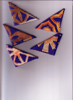
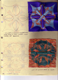
A "mola" is actually a blouse with the fabric stitched layered using a method reverse applique. It is possible that the traditional designs were originally used as designs for body painting, but when clothing was introduced, the same designs were used. Today, modern life influences the designs that are used, even to include words and advertising images. There may be from two to seven layers of fabric in a mola. In the multi layered molas, several layers may be cut through to bring different colours into the design. In the next few months, I plan on producing a mola, which I will display on this blog.
Of interest, at one of this summer's festivals at Victoria Park, in London Ontario, there was a booth displaying some exquisite molas, one of which was quite large. I spoke with the people there, and Herta Puls name was mentioned with great admiration and respect.
Kandinsky The Language of the Eye, by Paul Overy, SBN 236 17770 2
Bibliography:
Wassily Kandinsky Concerning the Spiritual In Art ,
translated by M T H Sadler, ISBN 0-486 23411-8
The Blue Rider, translated by Hans Konrad Roethel.
Kandinsky's art shows a great love affair with colour. "Color is the keyboard, the eyes are the harmonies, the soul is the piano with many strings. The artist is the hand that plays, touching one key or another, to cause vibrations in the soul." This and his first impression and reaction to of Monet's "Haystacks" Moved him further to the art we most know him for... his pictorial interpretation of "inner beauty".
I see these works as stitched.... appliques mostly, as many of his painting have clearly defined edges that work well in this method. His line drawings (in black paint) remind me of stitched lines... running stitch, stem or outline stitch, or couching. Other paintings appear to be painted fabric embellished with stitching. In particular, his Black Strokes, (1913) Circle and Square (1943) bring embroidery and stitching to mind.
Van Gough , by Judy Ellen Sund, ISBN 10 07148084X
Van Gough is one of my favourite artists. He uses colour and brush strokes boldly and fluidly. His Starry Night, Starry Night Over the Rhone, and Cafe Terrace at Night all depict stars with a luminous halo, The Brush strokes in all of these would be well represented with straight stitches, either running, seed,long and short. In some areas, a painted ground would be best, and the stitching on top.


